Finding meaning in everything we do has been our guide since the very beginning. This of course includes our logo as well! So, let’s look closer and find out what it stands for.
It all began with curiosity, a vision, and a suiting name – ICodeFactory. Since we are the factory that produces codes, it seemed like a logical name that easily presents our domain of expertise - showing that our services cover coding that makes clients’ ideas possible.
Our name is written with an - I - in front of CodeFactory, which has multiple meanings. First of all, it stands for the individuals working in the company. We care for each person working with us and nourish the surrounding which is beneficial for the mutual learning process and growth. Without it, the technical part of providing sophisticated and customized software solutions wouldn’t be possible. People working with us are constantly learning, gaining experience on various projects, and most importantly – supporting each other.
Secondly, the I in ICodeFactory also stands for interface in Object-oriented programming. Interface can be understood as contract, a guarantee that the implementation will be done in accordance to what was agreed upon. And we firmly stand behind what we commit to deliver to our valuable partners, customers and colleagues.
Working with people who support each other and think alike results in mutual understanding and easy-going communication – which is exactly how the story of the ICodeFactory logo started. It started with a collaboration with our colleague and a great professional. Knowing people standing behind ICodeFactory gave him a clear idea of what our logo should look like. So, without any iteration, having great insight into the values we work for and live up to, a suitable logo illustration was created - giving a powerful representation of the vision behind it.
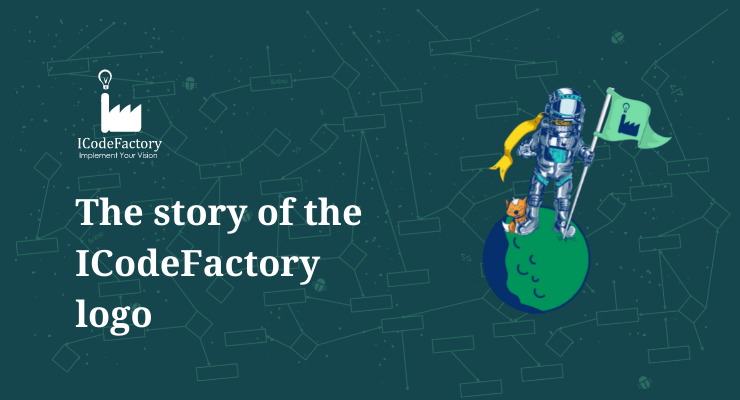
As you can see, it’s a small factory of ideas, that is shown as a light bulb coming out of the factory’s chimney. An interesting and important detail about it is a slightly asymmetrical nature of a lightbulb. The reason behind it is the understanding that ideas aren’t supposed to appear perfectly shaped. Imperfection is what keeps us growing because it requires innovativeness and innovativeness takes us beyond established patterns. That is what progress looks like.
Our logo didn’t miss the progress part either. Keeping the initial idea, we’ve made slight differences through the years, to adjust it to the visual changes we’ve made to our appearance. One of those changes is the green color we became recognizable for. The shade of green was intentionally picked to represent a natural color. The reason for that is the eco-friendly nature of the factory, where despite our name might point to a factory, we only produce ideas – making no environmental waste out of it. Besides, supporting local ecological organizations is a part of our mission.
Speaking of habits, in a way, they represent dedication and make it easier to stay persistent. Still, it’s important to create new ones and - from time to time - do something extraordinary. This brings us to the main point, to our credo that inspired logo creation and has been leading us through all this time: To implement it, you need habits and routines, but to come up with a vision, you need ideas and dreams that are not part of your habits.
Now, as a part of a habit of concluding what one started with, we’ll come back to the beginning. We started this story by introducing you to the meaning behind our logo. We will conclude it with a simple, yet meaningful message our logo sends: Both sides of the coin are equally important, being a dreamer and being a doer. Being both means being imperfect, but still doing and learning something, which means - always growing and progressing.